Ghost supports a variety of content cards that make your posts visually engaging and easy to structure.
This page showcases how each card type appears within this theme — giving you a sense of spacing, typography, and visual rhythm when using them together.
Callout Card
Callout cards are used to highlight key notes, quotes, or short messages.
They can appear in several styles such as info, success, warning, or neutral.
They’re effective for short confirmations, best practices, or brief celebrations of progress.
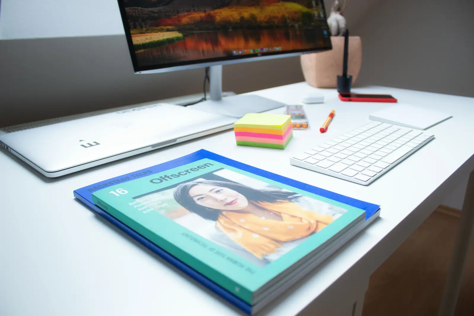
Image Card
Image cards let you add visual content between text. You can set images to appear regular, wide, or full-width, depending on how you want them to stand out in the layout.
A regular image works well for inline visuals or smaller illustrations that complement written content.

Wide setting let an image stand out a bit more and introduce a stronger visual break between sections.

The full-width option expands the image edge to edge across the viewport, creating an immersive visual moment.
Gallery Card
A gallery card displays multiple images in a responsive grid layout.
It’s well-suited for collections, product views, or visual storytelling sequences.


Each image can be opened in a lightbox view, allowing readers to explore the gallery in a larger, focused popup without leaving the page.
Bookmark Card
Bookmark cards provide a rich preview of an external link, including the title, excerpt, and featured image of the referenced site.

Call to Action Card
A Call to Action card pairs text with a button, encouraging readers to take a specific action such as subscribing, downloading, or visiting a page.
Build your own space on the web. Publish fast, stay independent, and keep full control of your content with Ghost.
Toggle Card
Toggle cards let readers expand and collapse content sections, useful for FAQs, notes, or technical details. Multiple toggles can appear together to present related content in an organized, space-saving way.
What is a Ghost Card?
Ghost cards are rich content blocks that let you add visual or interactive elements—such as images, galleries, bookmarks, callouts, or buttons—directly within your post.
They help structure articles and create more engaging, visually varied layouts.
How do I add a card?
Cards can be added from the Ghost editor using the “+” menu or by typing a forward slash ( / ) to open the quick card selector.
From there, choose the card type you want, such as image, gallery, bookmark, or callout, and insert it seamlessly between paragraphs.
Button Card
The button card provides a standalone visual link.
It can be aligned left, center, or right to fit the rhythm of surrounding text.