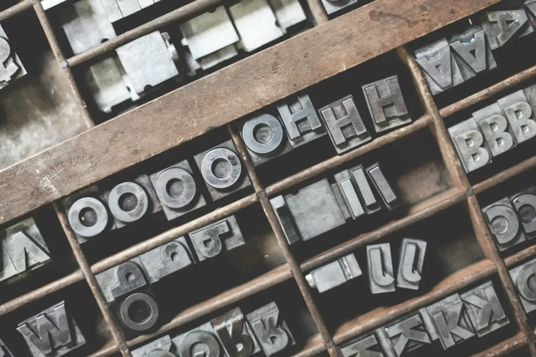
When I first started designing my own blog, I thought typography was just about picking a font that looked “cool.” I couldn’t have been more wrong.
Typography isn’t decoration — it’s invisible design. It’s the quiet rhythm that makes a page feel calm or chaotic, serious or playful. When it’s right, you don’t notice it. When it’s wrong, you can’t read more than a paragraph.
The Personality of a Type
Every font has a personality.
Some whisper; others shout. Some want you to slow down and think. Others push you forward, line after line.
- Serif fonts tend to feel traditional, trustworthy, and reflective — perfect for essays or long-form writing.
- Sans-serif fonts are modern, clean, and pragmatic — great for UI, code, and minimalist sites.
- Monospace fonts are structured and technical — the soul of a developer’s aesthetic.
Choosing a typeface is choosing a tone of voice for your writing.
Hierarchy Is the Hidden Architecture
Headings aren’t just bigger text. They’re anchors that help readers navigate your thoughts.
# H1 — Title
## H2 — Major Section
### H3 — Subsection
#### H4 — Detail or Note
Good typography gives each level a distinct weight, line spacing, and rhythm.
When done right, even a quick scroll gives a sense of structure and pacing — no extra design needed.
Whitespace Is a Design Tool
Whitespace isn’t empty. It’s breathing room.
When you leave space between lines, between paragraphs, between ideas — you’re helping the reader’s brain rest.
It’s not about minimalism; it’s about clarity.
“Good design is as little design as possible.”
— Dieter Rams
My Rule of Thumb
If it feels right to read, it looks right too.
Typography is the bridge between code and emotion. It’s the most human part of a digital space — the texture of words that makes a screen feel alive.
So when you’re building your next project, don’t just think about the colors, grids, or animations.
Think about how your words feel on the page.
Because typography matters more than you think.
